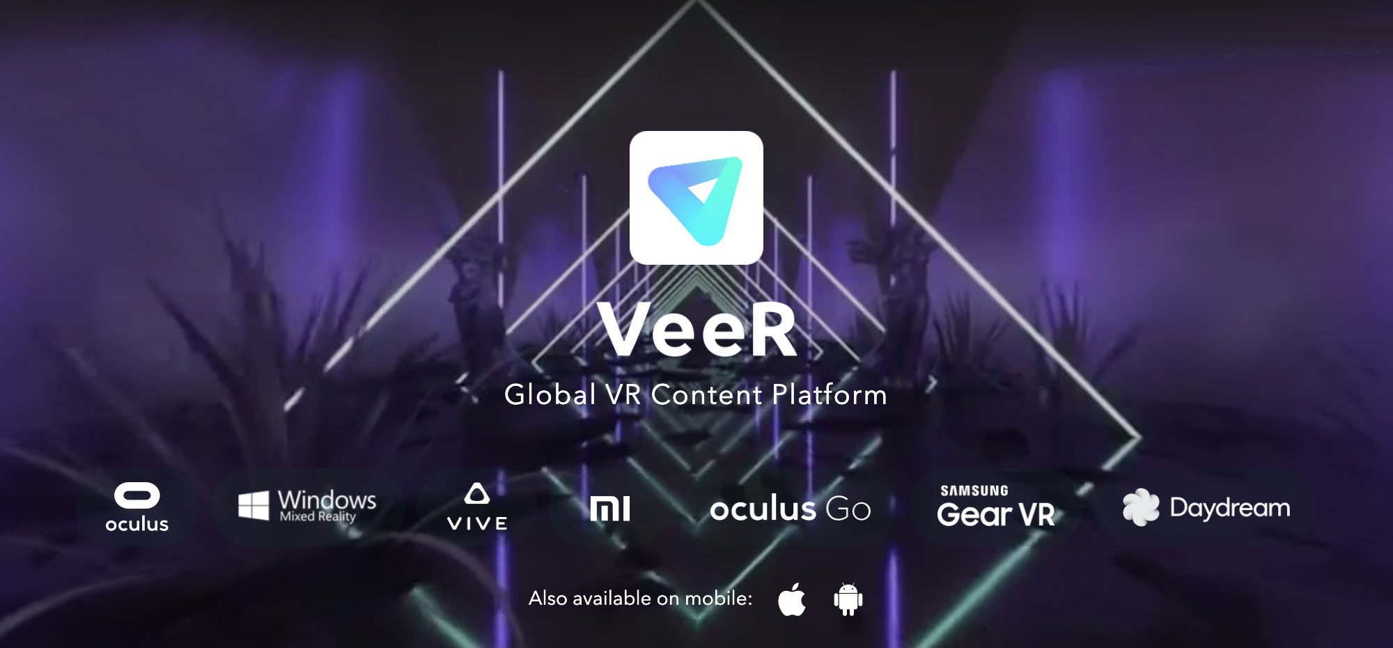
VEER
VeeR VR: Designing for Immersive Storytelling
The Challenge: Navigating the Unknown
It was 2018, and VR was still a frontier. The hype was real, but the adoption? Not so much. VeeR VR had started as a community-driven platform, where anyone could upload VR content. It was a bold move—giving creators a space to share—but there was one major problem: user-generated content was inconsistent in quality, and VR headset adoption was slow. Viewers struggled to find engaging content, and as a result, engagement suffered.
VeeR needed a shift. It wasn't just about showcasing VR content; it was about creating a premium cinematic experience that kept users coming back. That's where I came in. As a UX designer, my mission was to redefine how users discovered and consumed VR content in an emerging medium. The challenge? Make something new feel intuitive.
As the UX designer, I owned, designed and delivered the experience for:
As the UX designer for the VR platform, I'm proud that since VeeR VR 2.0's launch in 2018, we have achieved high consumer satisfaction rates, strong user retention, and best-in-class overall user experience.
The Pivot: From Community to Premium
When I joined, the team had already made the decision to focus on high-quality, curated VR storytelling instead of raw user uploads. But this shift required a complete rethinking of the product experience. If users were going to pay for content, we had to make discovery seamless, the experience immersive, and the transition between mobile and VR effortless.
It started with research. We dove into:
- User behavior studies: How long did people stay in VR? What frustrated them? What kept them engaged?
- Market insights: What were other platforms getting wrong?
- Content structure analysis: How could we make discovery frictionless?
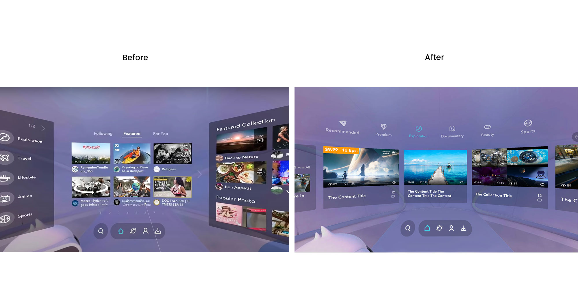
One thing became clear: our Feeds section needed a complete overhaul.
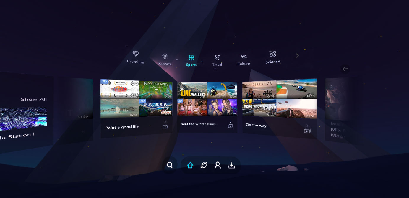
Feeds Redesign: Making Discovery Effortless
The Problem
Users told us the same thing: "It's too cluttered." The old Feeds section felt overwhelming, like stepping into a movie store where everything was randomly scattered. The cognitive load was high, and users didn't know where to start.
To dig deeper, we conducted a series of user interviews and observational studies. We visited VR arcades and observed how first-time users interacted with the platform. Many struggled to locate content they were interested in, often resorting to trial and error. We also ran in-app heatmap tracking, which revealed that users were hovering over multiple sections without clicking—indicating hesitation and confusion.
One key moment stood out: during a remote usability test, a participant sighed audibly and said, "I just want something good to watch, but I don't know where to look." This summed up our problem perfectly.
After synthesizing our findings, we categorized the core issues into three main areas:
- Information Overload – Too many content thumbnails on a single screen with no clear hierarchy.
- Lack of Personalization – Users had to scroll endlessly instead of being guided towards relevant content.
- Navigation Fatigue – The browsing experience felt like work rather than entertainment.
These insights set the foundation for our Feeds redesign.
Data Analysis
To inform our design decisions, we carefully analyzed data from various sources:
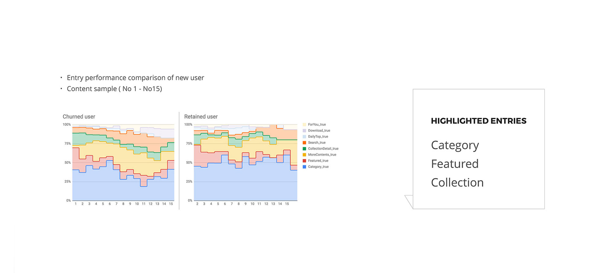
Entry performance comparison – By analyzing the content performance between new and retained users, we were able to identify which entries (e.g., featured, category, collection) were performing better for each user group.
The heatmaps and performance comparison data (from both churned and retained users) helped us identify key areas for improvement. For example, we observed that retained users were more likely to interact with categorized or featured content, while churned users struggled to find engaging content within the default feeds.
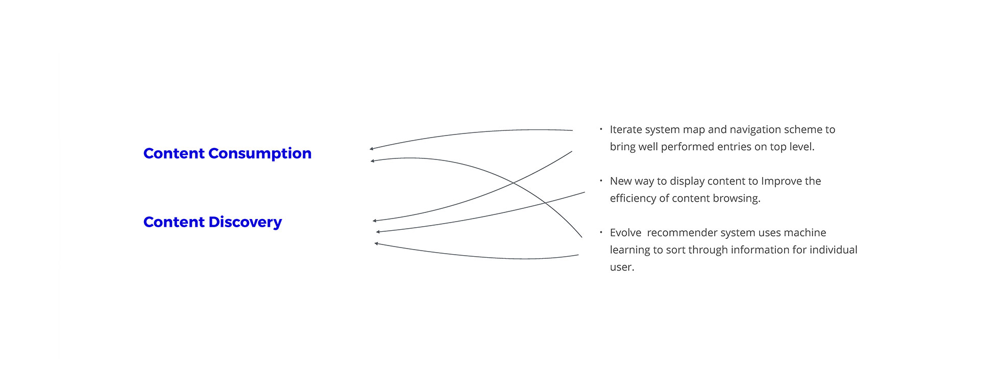
Content consumption and discovery metrics – We looked at user patterns to understand how people were navigating the app. We used these insights to iterate on the system map and navigation, ensuring well-performing entries were prioritized for visibility.
The Solution
We rethought everything from the ground up:
- Reorganized content by categories, making it easier to navigate.
- Built a machine-learning recommendation system to surface the most relevant content.
- Simplified the UI, removing distractions and focusing on the content itself.
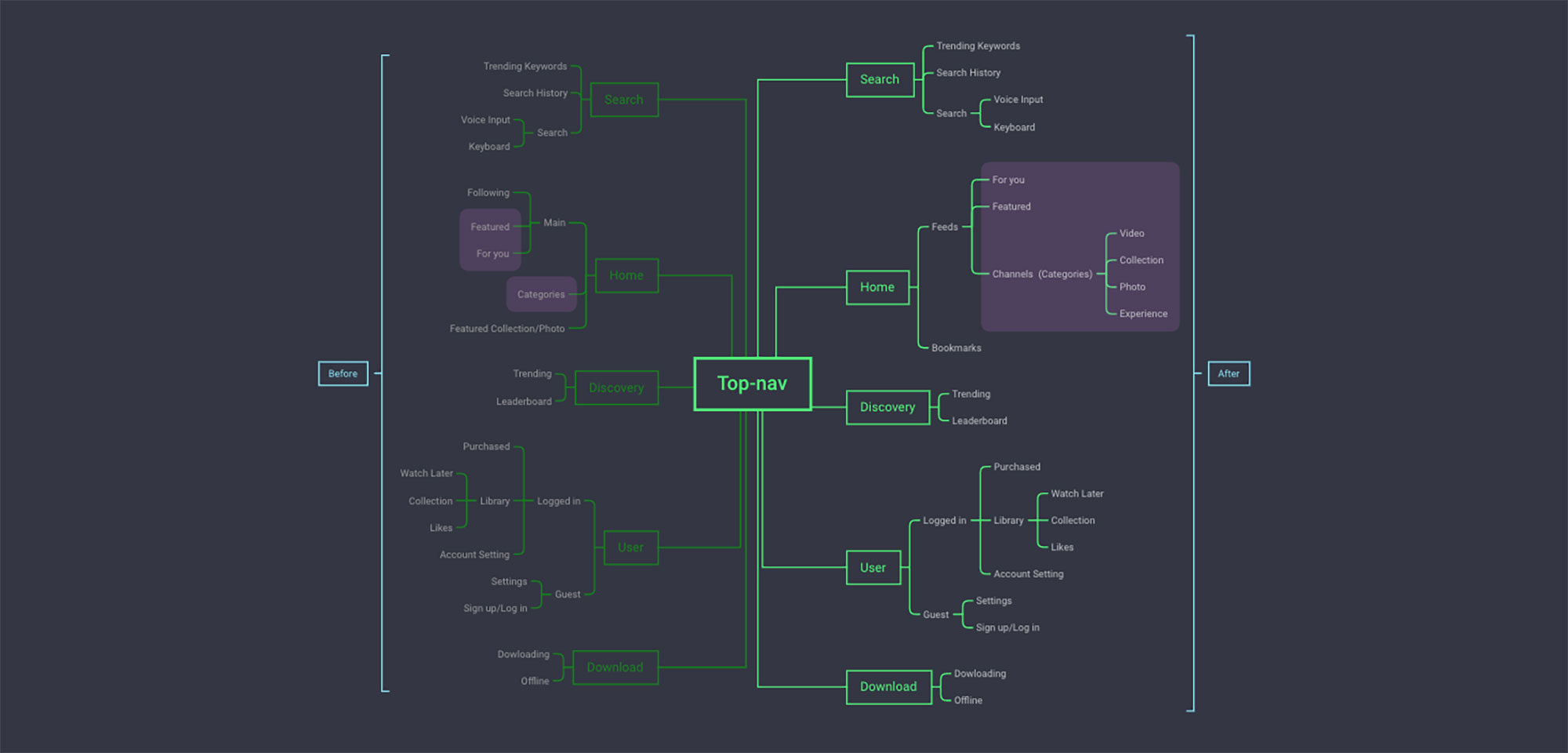
Rearranged navigation level to put well-performed entry at first place. The new information architecture:
Environment
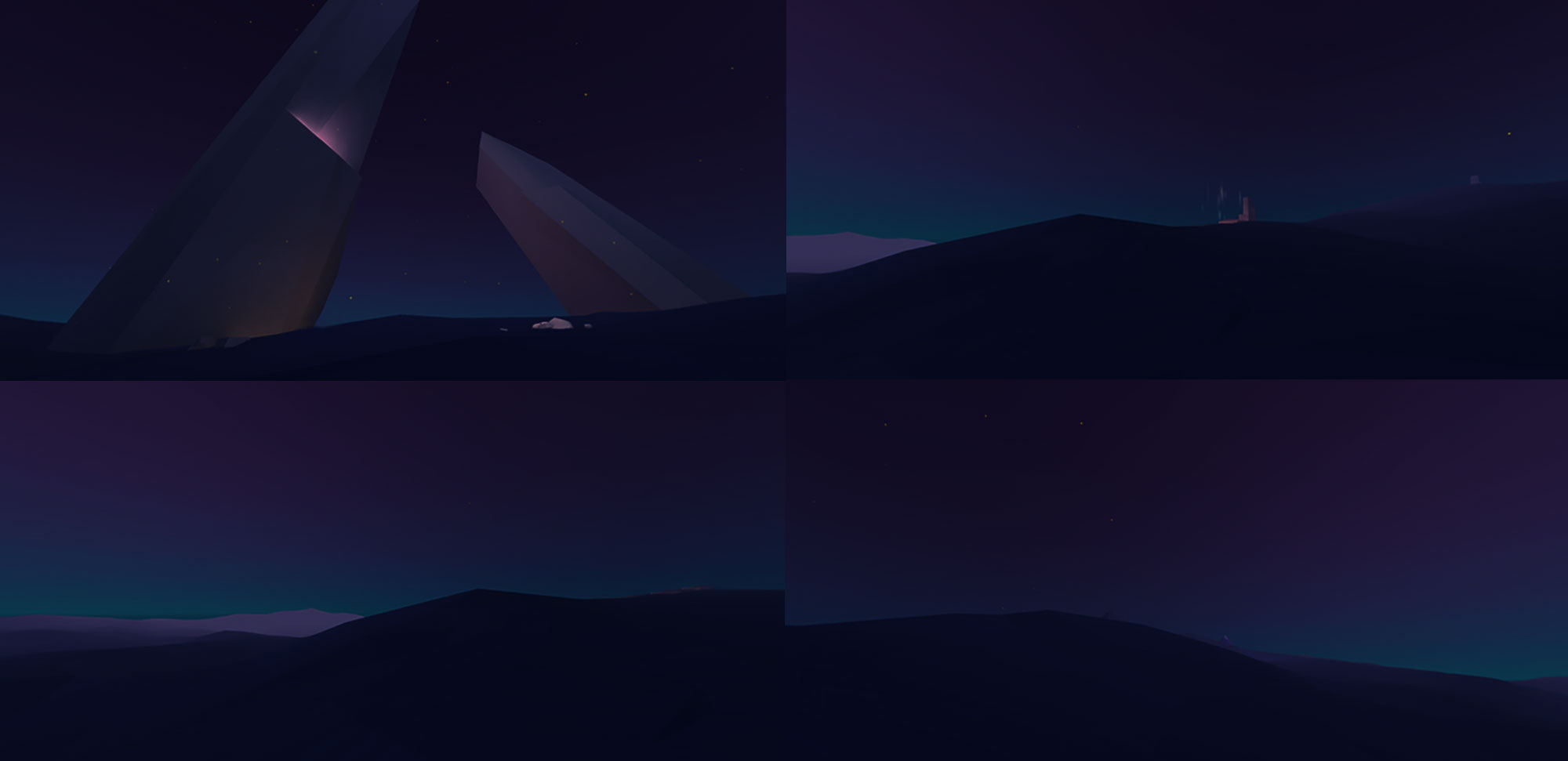
In addition to optimizing the content feeds, we also recognized the importance of enhancing the overall VR environment.The previous VeeR Land (the purple background behind the UI) was not optimized for VR use. Many users reported that the bright color caused eye strain, especially during longer sessions. Additionally, the design did not work well with the UI in terms of visual hierarchy and aesthetic cohesion, making it harder to focus on the content.
To address these issues, we reimagined the VR environment. After completing the Feeds redesign, I prototyped a new background scene in Unity. The new design aimed to be more soothing and immersive, reducing strain while maintaining an engaging atmosphere. The change significantly enhanced the user experience, making it more comfortable for users to spend extended periods in the app without discomfort.
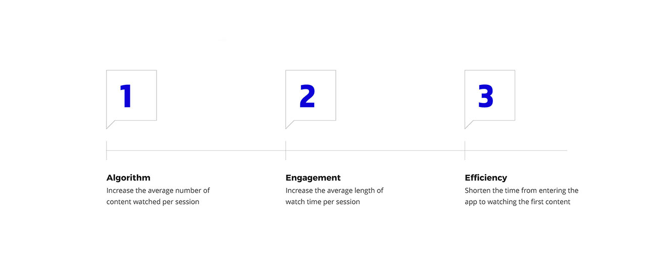
As the result of this redesign, the average number of content watched per session has inceased by 69.8% and the average length of watch time per session has increased by 34.4% comparing with old version.
The Bookmark System: Bridging Mobile and VR
The Insight
We noticed a pattern: users browsed content on mobile but consumed it in VR. The problem? There was no way to save content for later.
To address these limitations, we developed a cross-platform Bookmark system. Users can save content through our website or mobile app, which syncs to their VR app under the same account. This allows users to quickly access their saved content when they return to their VR headset.
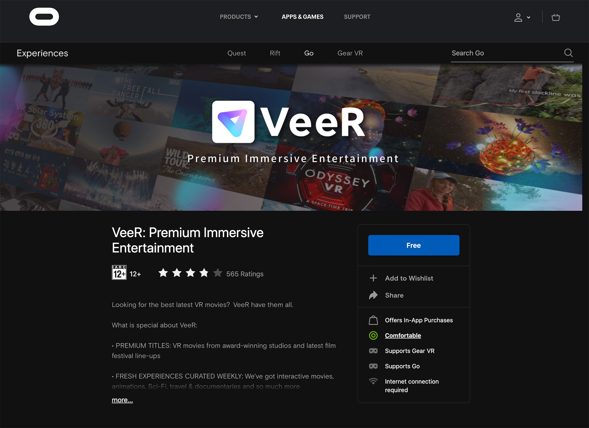
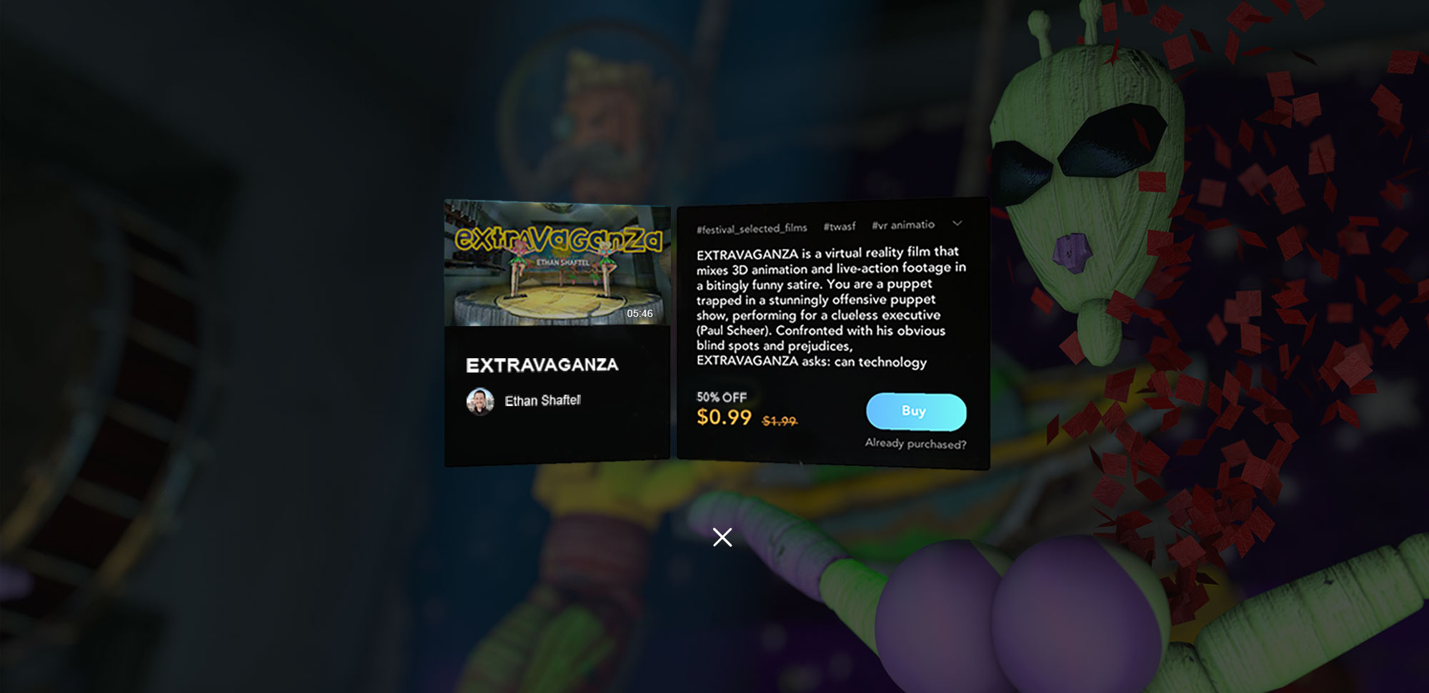
Paid Content
In late 2018 we introduced a paid section on our platform. It was our first try for monetization, the model was pay-per-view for cinematic content.
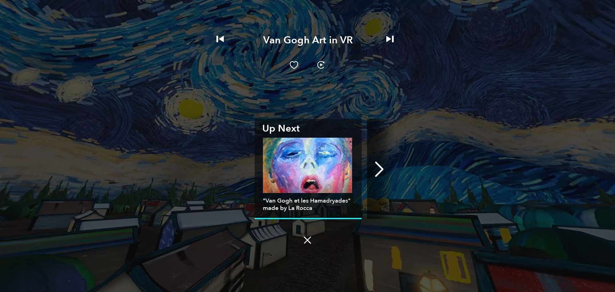
Player: Up Next Optimization
Making decision results in cognitive load. Desirable browsing behavior needs to be primed by default options you set for them. At the end of each watch section, we did some optimization to display some relavent content to our user, based on algorithm.
VR experience optimization
It's all about User. We did many user experience optimazaiton: add voice input; toggle UI based on controller tracking during video playing; add trailer for paid content; 360 panorama image background preview in content details page; etc.
Research and Collaboration
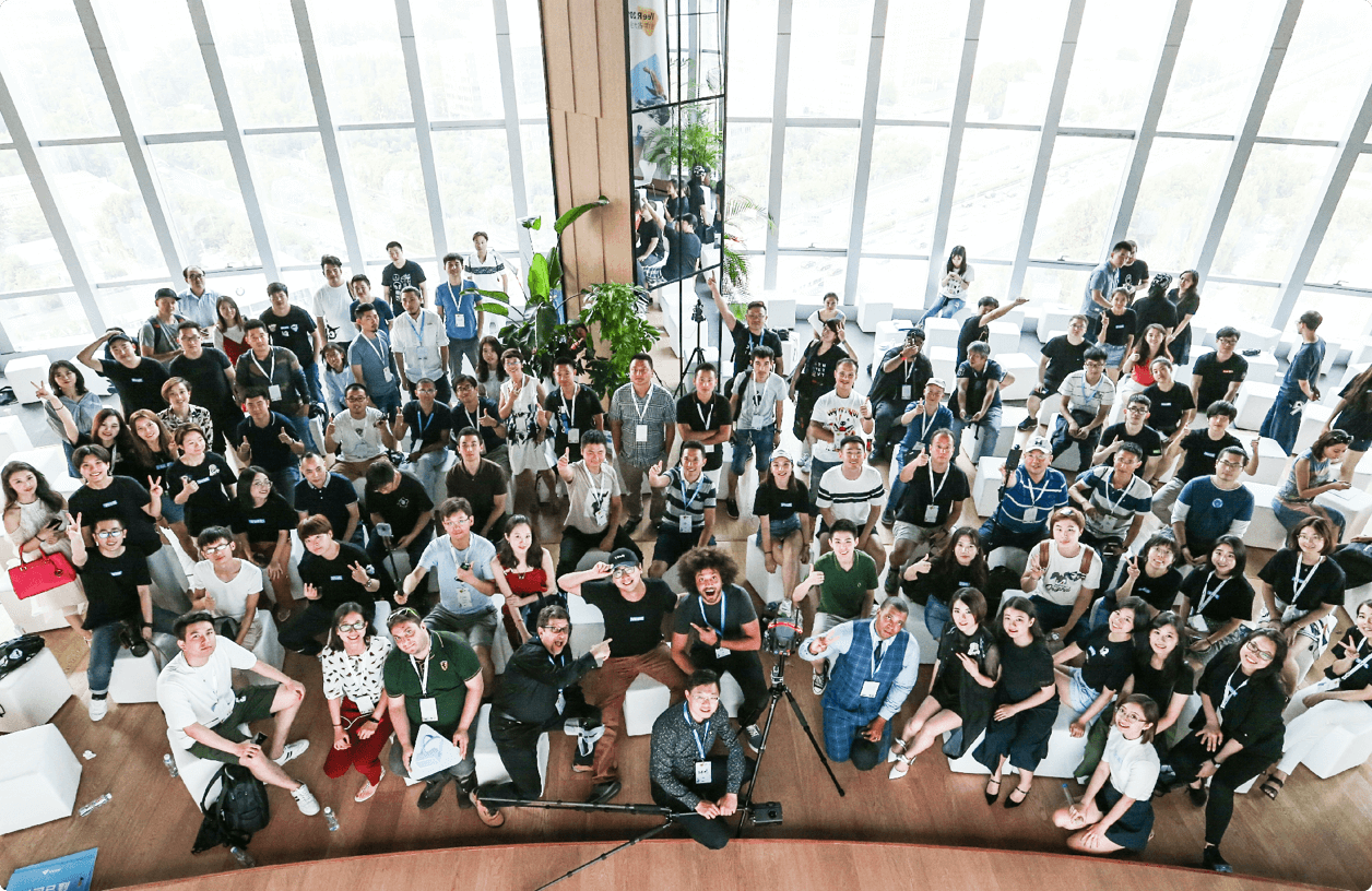
Our design and research teams maintain continuous dialogue with users through regular testing and validation. We also host the annual VeeR Creator Conference, bringing together outstanding global VR content creators to exchange ideas and production experiences.